What makes for good logo design, and is it really that important?

Having studied brand and logo design for close on 13 years, we are very clear about why having a good logo to represent your business is of uber importance. But we want you to be clear on why that is, too.
Let’s start with the basics: what is a logo? A logo is a combination of visual elements and text that have usually been designed and compiled using a graphics software. A logo represents your business, and is essentially your business symbol.
Logos help differentiate your business from that of your competitors, and in some instances they become so valuable that people start wearing them as a fashion statement (think Nike).
As a business symbol, it’s important to remember that when your customer sees your logo, they’re not just seeing a visual symbol or graphical element - they are actually seeing your business as a whole. Like the values your business encompasses, the promises your business has undertaken to keep, the value you offer your consumers, your brand essence, and so on.
Your logo, like any other brand touch point, is of also a representation of how much you value your business and are vested in it. If your logo looks like it’s been designed in Microsoft Paint, people are naturally going to feel very hesitant and skeptical about supporting your business as it seems you don’t even invest or support your own business!
When it comes to what constitutes a good logo there is no right or wrong, but rather some general rules that we as designers follow to produce the best results. For example, it makes common sense to have an apple in your logo if you’re an apple farmer. But take Apple as a company for example - it doesn’t seem to make much sense for a computer company to have an apple as it’s business symbol at first, does it? But on closer inspection, (and this is where good branding and marketing have a huge role to play in the success of a business), and getting to know the brand behind that very simplistic apple logo, you will find that actually it makes perfect sense. The apple is a great symbol for a company like Apple, which was founded on the basis of innovative and out-of-the-box thinking, a fresh new approach to computing, etc. In such instances a seemingly random symbol like the apple in the Apple logo may become even more of a powerful symbol because of these deep rooted values and analogies associated with it. The apple becomes symbolic not of what the company does but rather of who the company is.
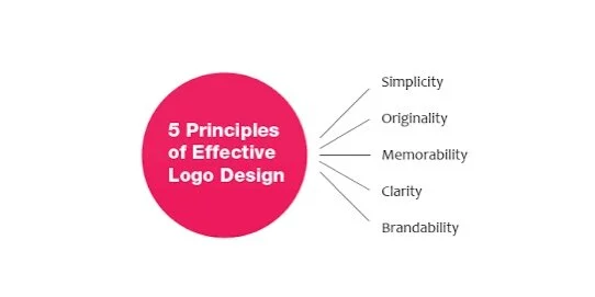
A good logo is distinctive, appropriate, practical, graphic and simple in form, and it conveys the owner’s intended message. A concept or “meaning” is usually behind an effective logo, and it communicates the intended message. A logo should be able to be printed at any size and, in most cases, be effective without color. A great logo essentially boils down to two things: great concept and great execution.
“Some wonder what’s so difficult about creating a good logo. They’re small, they look easy to do, so no problem, right? When you only see the result of a designer’s efforts, the logo creation can look like it was a simple task. But it’s not. A logo takes thought and creativity, and many elements combine to make a good one.” (via Harrison Mcleod)