

Brand Design
Cape Town Doctor
Client
Arguably the best Aesthetics Doctor in Cape Town, Dr. Jan Nel, A.K.A. Cape Town Doctor, needed some help with his branding. It had been many years since he’d updated it, and it seemed to lack congruency and consistency. It also felt a little too cold - not enticing nor encapsulating his desired market. We gave his brand a much needed face-lift, and he was thrilled with the result.
_____
Project
Logo & Brand Identity Design.
Date completed: 22 May 2020
_____
Logo Design
The client wanted to somehow incorporate a a metallic silver colour into his branding, which called for a very simple yet sophisticated logo design. The medical practice is essentially masculine and the logo needed to exude professionalism, masculinity, and perfectionism.

Concept in black & white

Colour version with metallic overlay

Light version with metallic overlay
Moodboard
The mood encapsulates a strong balance of masculine and feminine, and of warm and cold.

Colours
The main colours in this cool colour palette are derived from the Mercedes F1 car (silver and teal), and the accent colours
are derived from tones in the mood board.

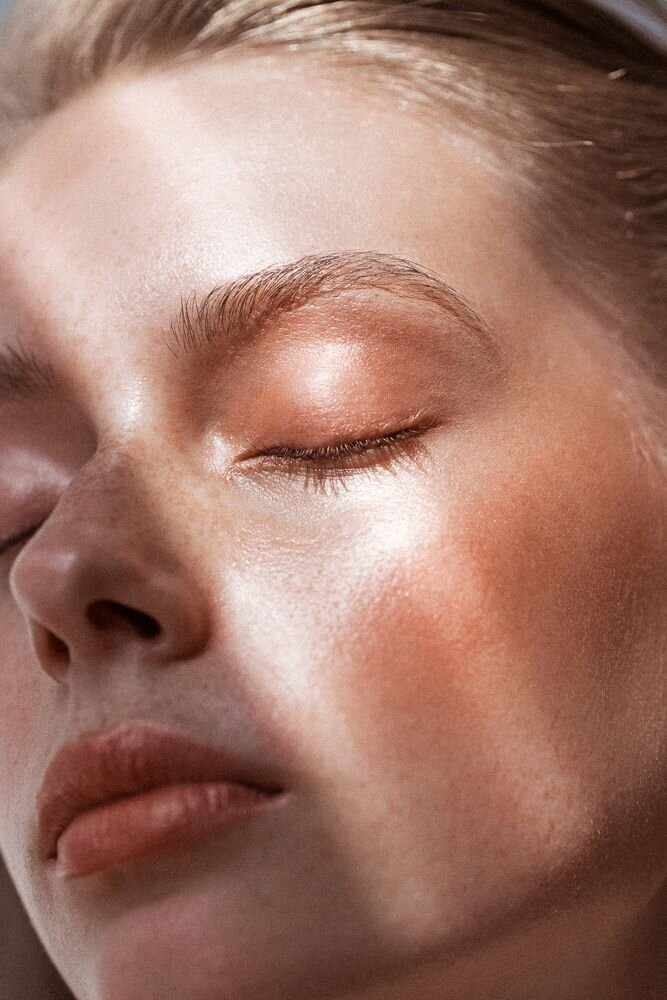
Imagery
Images were very intentionally chosen to reflect warmth and to emit a certain emotion of desire, this to
contrast well with the cool tones of the colour palette. We wanted images that looked beautiful, yet natural, still showing
skin texture and using only natural light.

Fonts

Stationery


~ Fin.